A series of candles inspired by the Brothers Grimm fairy tale "The Blue Light."

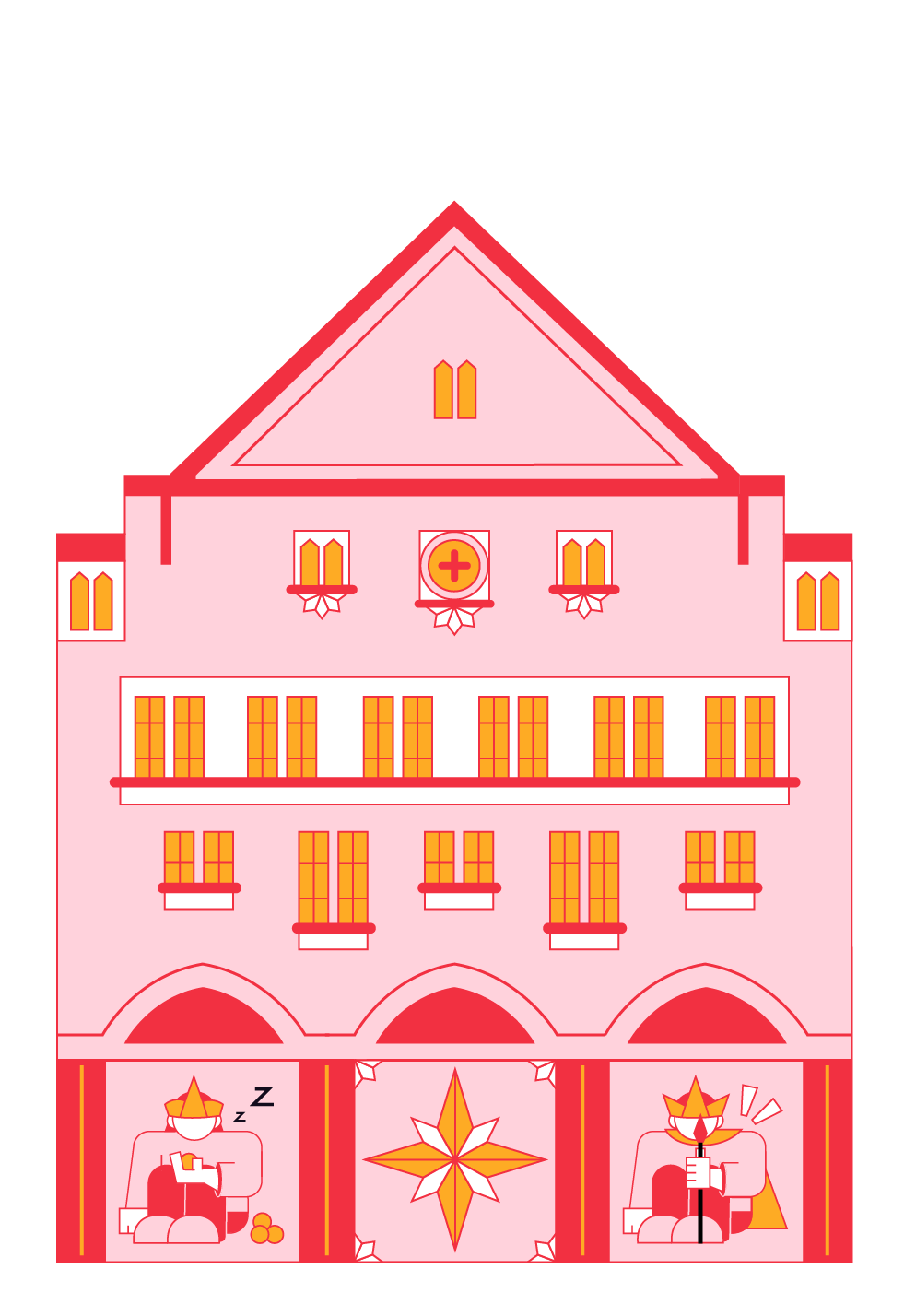

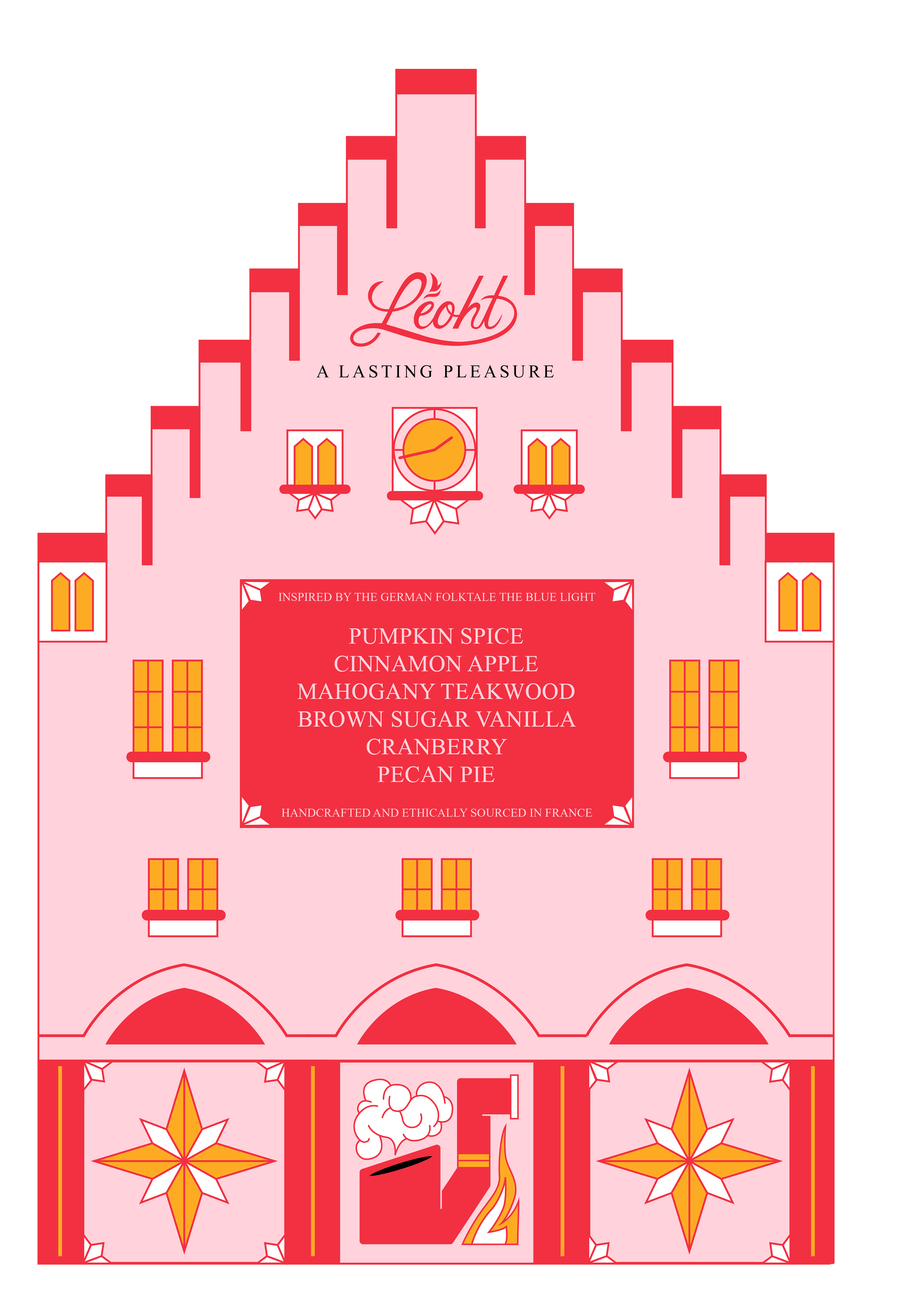
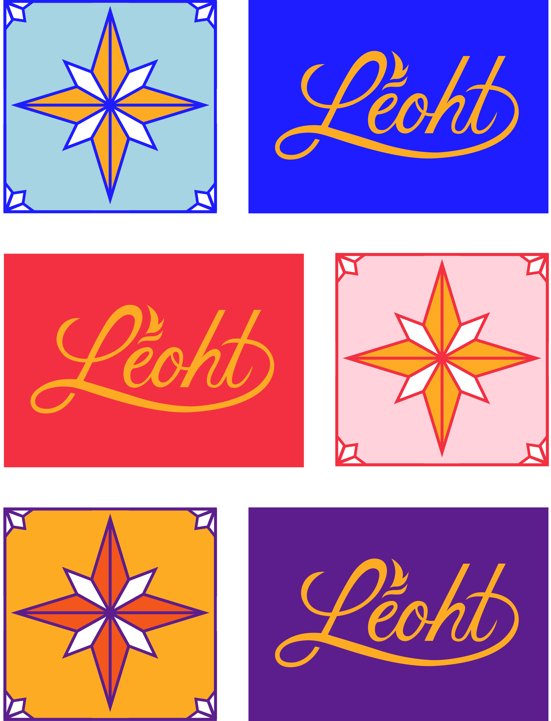
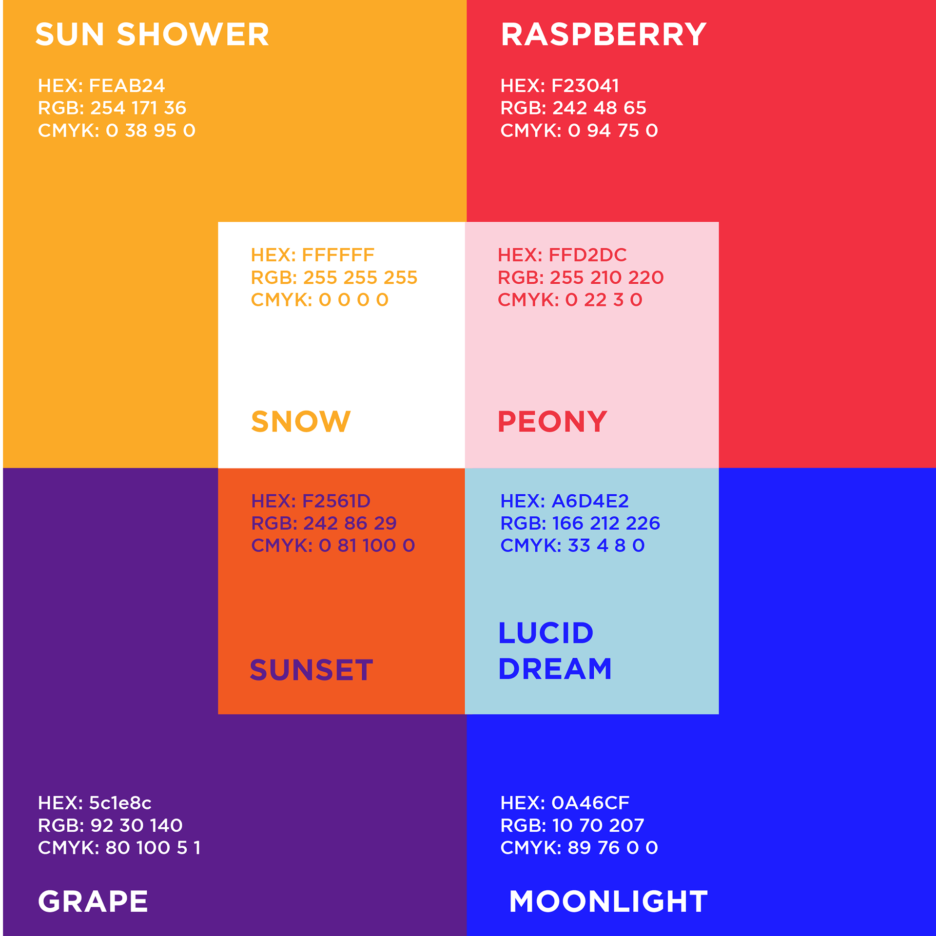
For the packaging, I decided to have three colorways that could stand on their own but still look cohesive when placed together. The blue colorway is the face of the brand — following the theme and symbolism of "The Blue Light" folktale — whereas the orange and pink colorways are used for specialty scents/flavors that pay homage to German architecture and emphasize the energy a candle flame has. When placed together, the cool and warm tones are meant to emphasize the vibrant aura of the brand.
Above you can see the colorways being applied to the logo and pattern system.
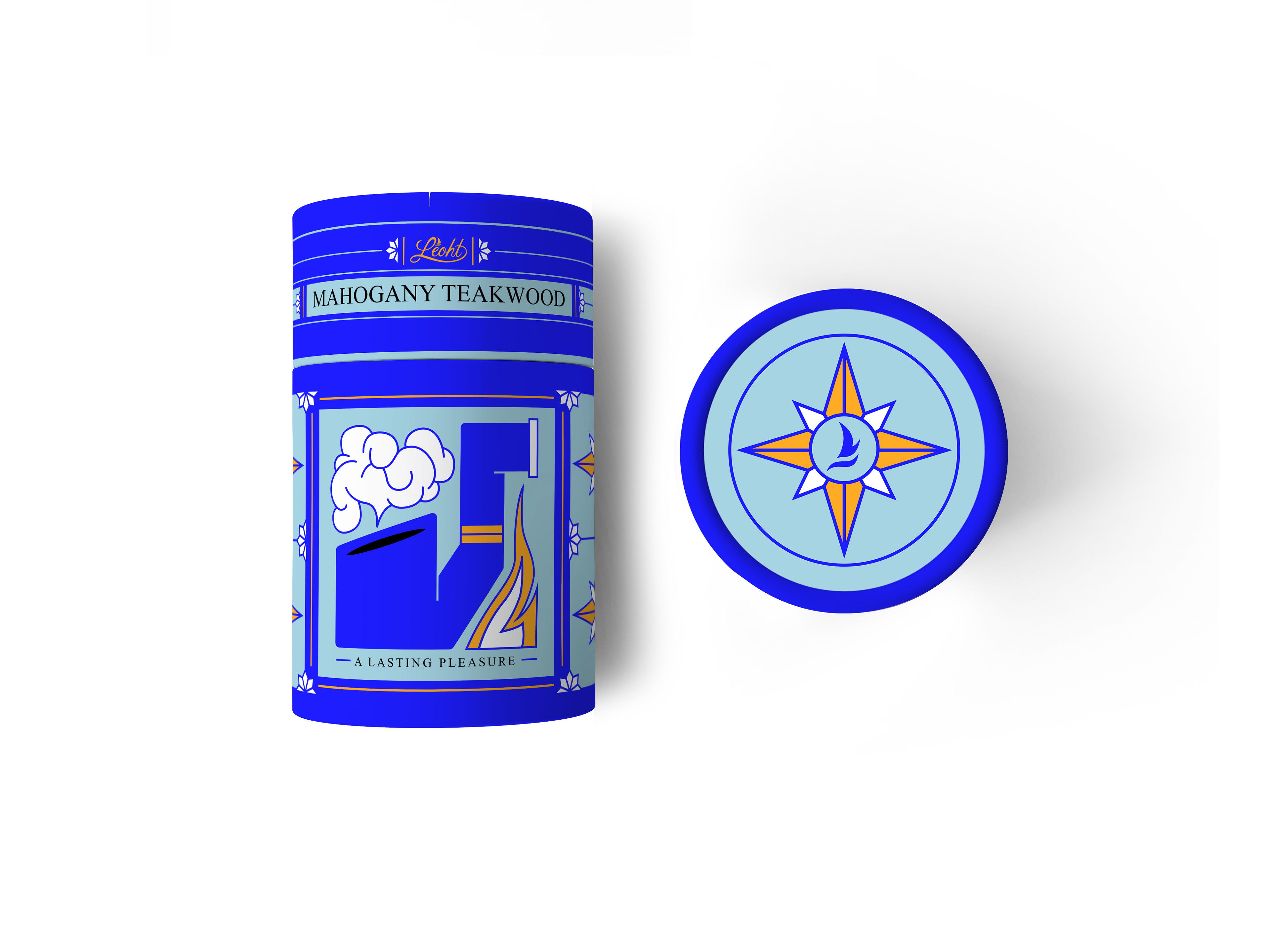

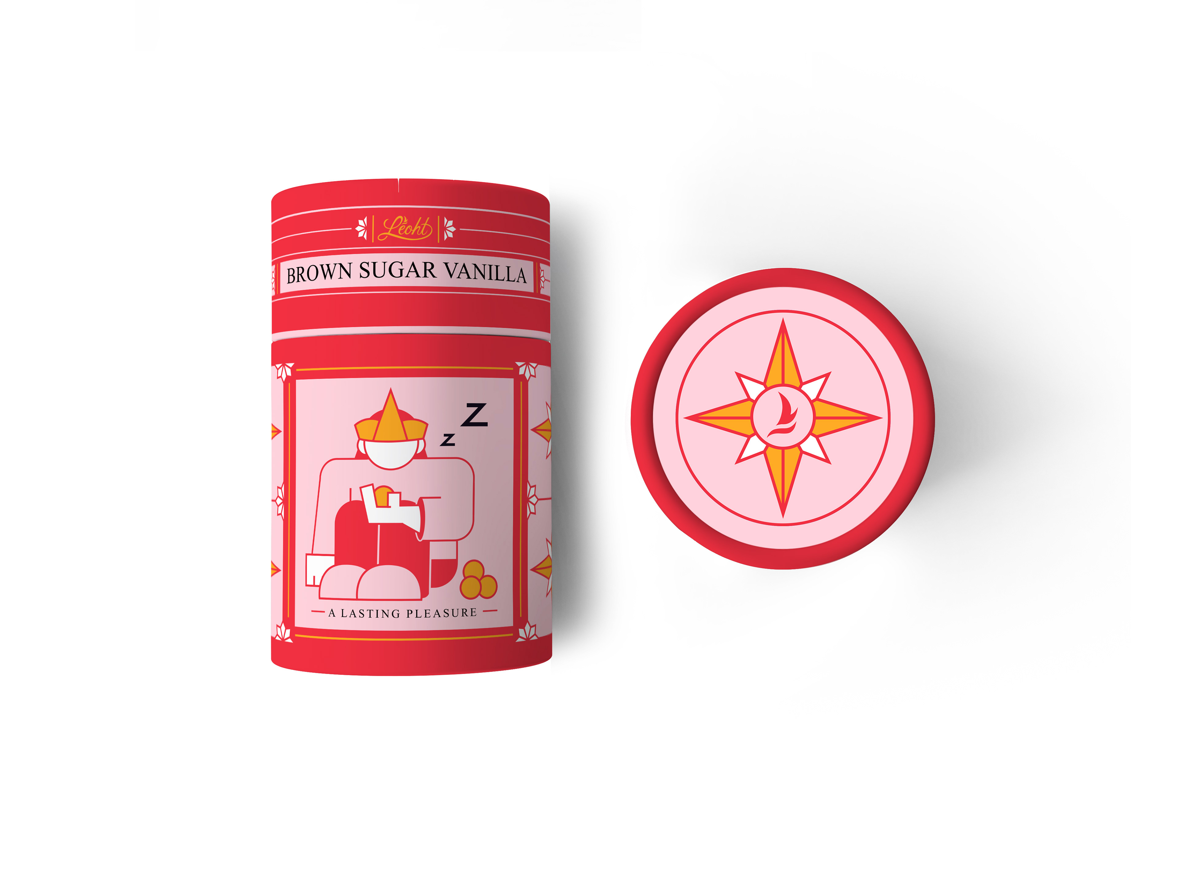

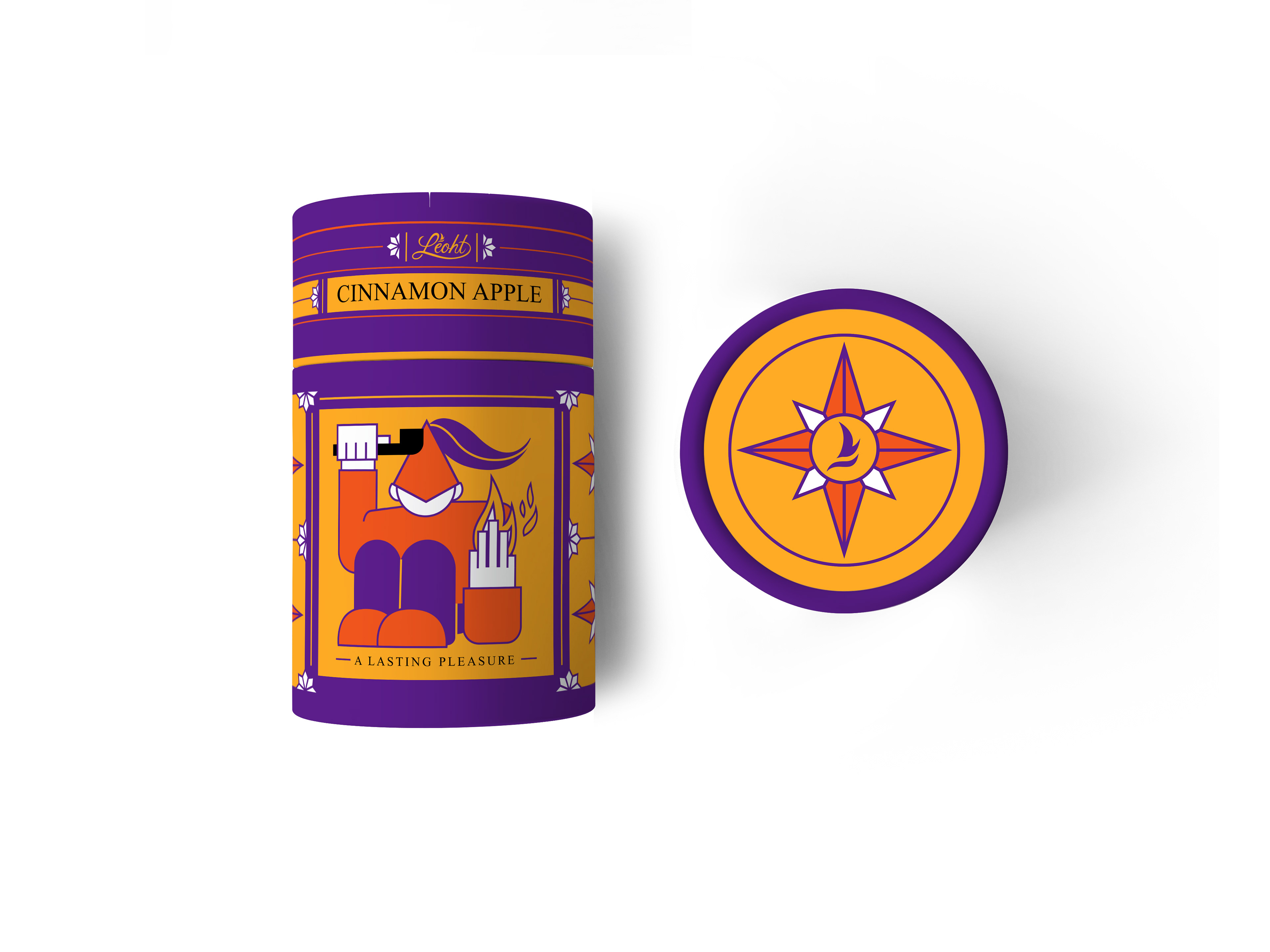
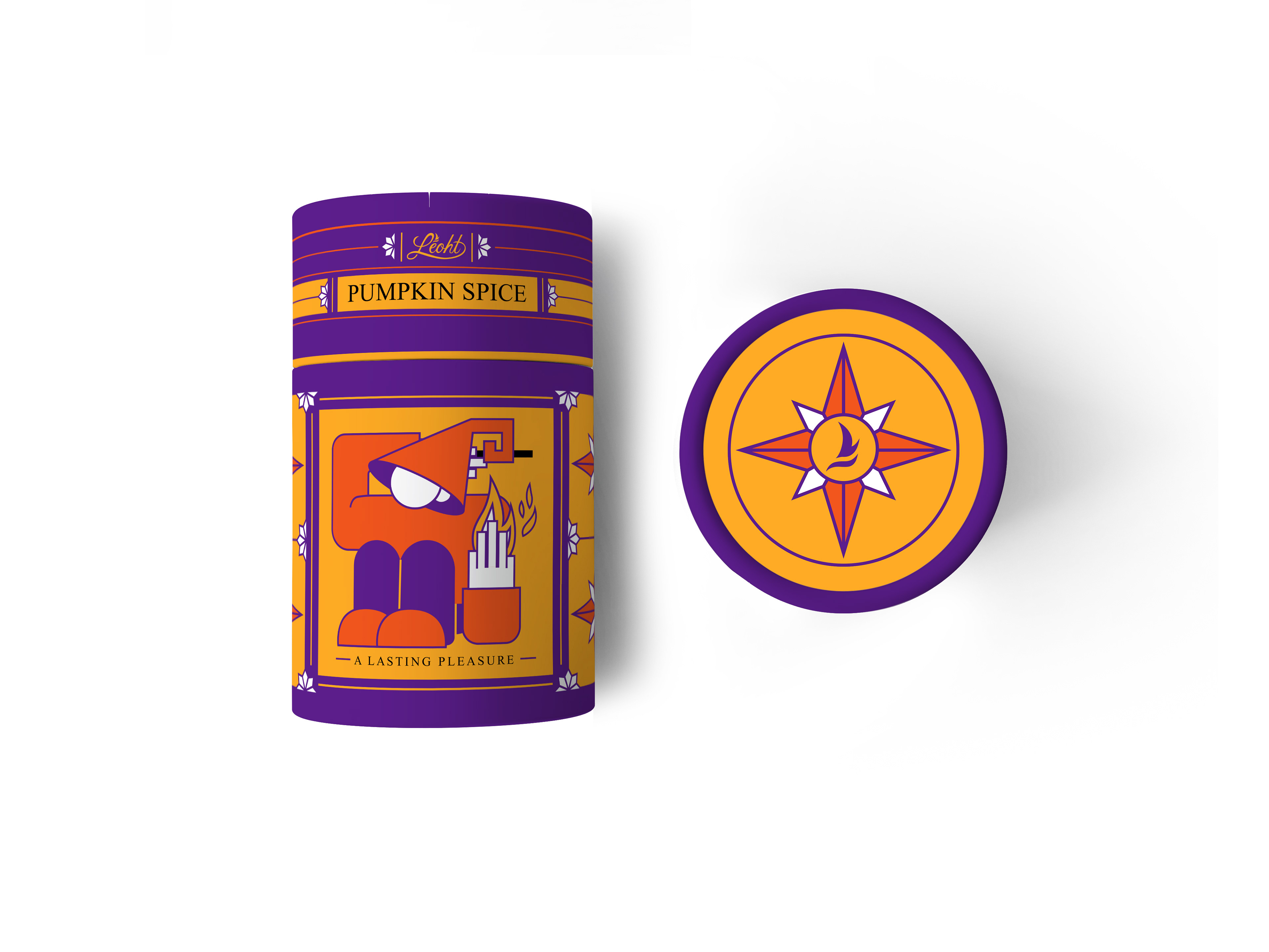
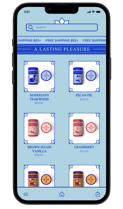
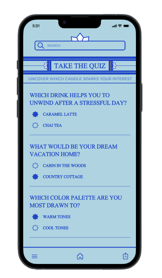
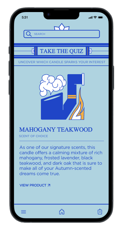
To see what kind of experience could be created for users who wished to order these candles online, I created a mobile app/site that would give users access to more information about the candles and how to purchase them.
I wanted the heavy theming of the product to translate over to the app so that users could still feel immersed in the product experience. Additionally, I decided to design screens that would allow users to take a quiz and see which candle scent would suit them best so that they could feel more connected to the candles they planned to purchase.

For this project, I documented my design process and some additional deliverables in a process book. Feel free to flip through a digital version of the book below!