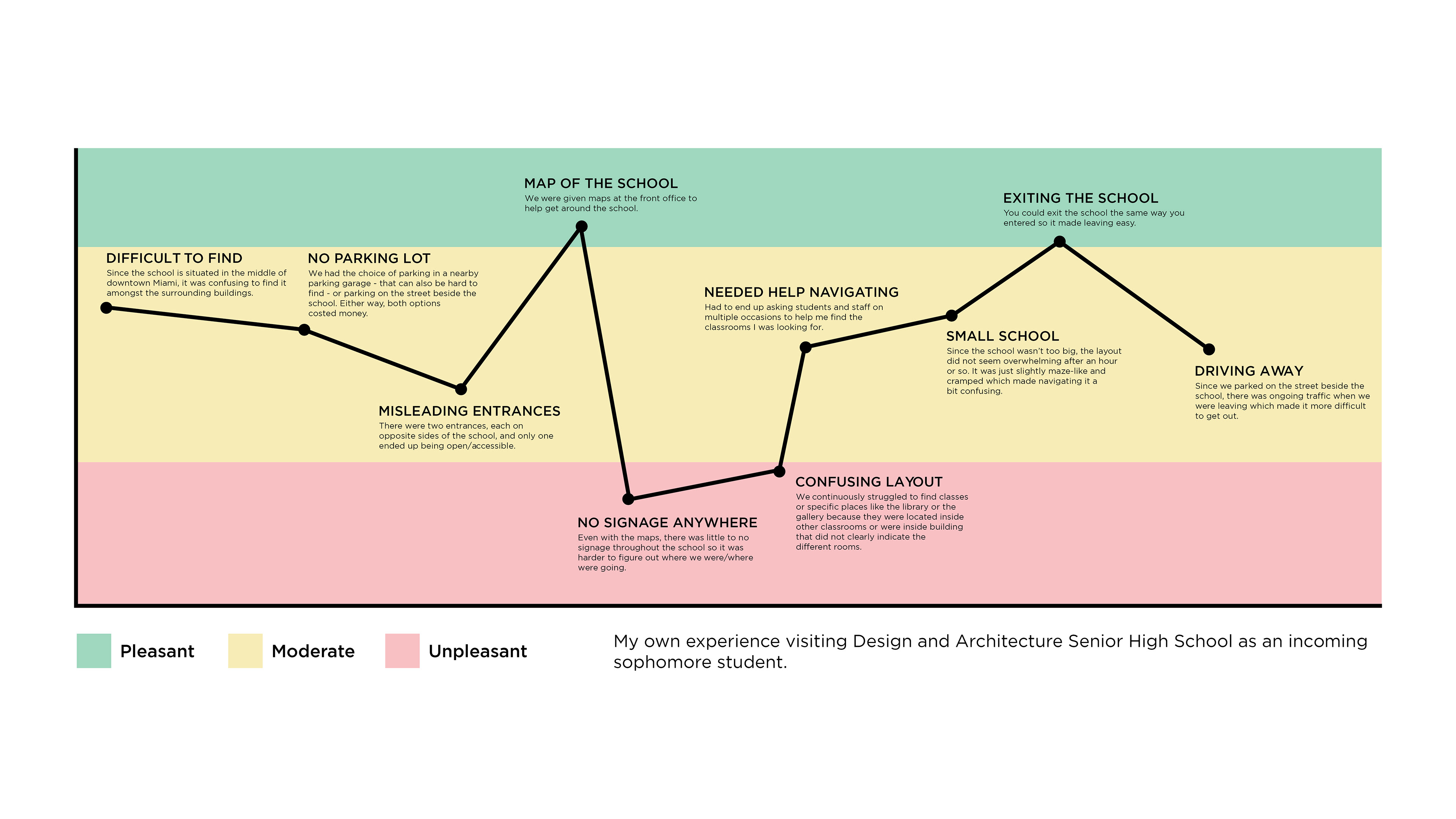
Since this high school's building was initially part of a shopping mall, the architecture of the building is quite confusing to navigate in a fast-paced, school setting.
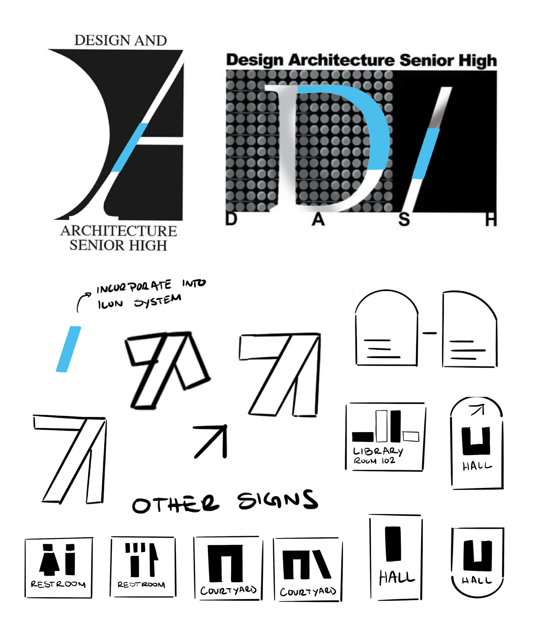
Thus, my goal for the project was to improve the user experience by creating a signage system that could help parents and incoming students better orient themselves within this unique campus


Inspired by the visual identity system created by Michael Bierut for the MIT Media Lab, I aimed to create a set of bold yet minimal icons that were extracted from the marks being created in the high school's logo. Using the dash and slants in the logo as my foundation, I created a system of directional symbols and landmarks that would help students and parents navigate the campus.